Best Computer Monitors for Reading Text 2026: Which One Fits the Way You Use It?
Disclosure: We may earn a commission when you buy through links on this page, at no extra cost to you. As an Amazon Associate I earn from qualifying purchases. Learn more
Compare the best computer monitors for reading text by pixel density, panel finish, and stand fit, with guidance for students, writers, and office readers.
A screen that feels fine for video can still make a long document feel like work. Letters soften at the edges, your eyes keep refocusing, and by mid afternoon the page seems to swim. Choosing among the best computer monitors for reading text starts with how you actually read each day: short mail between meetings, long reports, dense code, or book length drafts.
This guide sorts monitors by reading routine instead of by spec sheet bragging. It covers which numbers govern sharp text, which features matter less than sellers suggest, and how the comparison table below matches your reading hours.

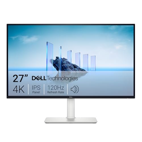

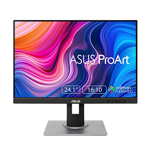
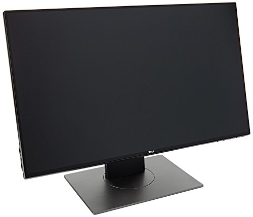

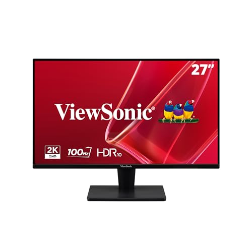
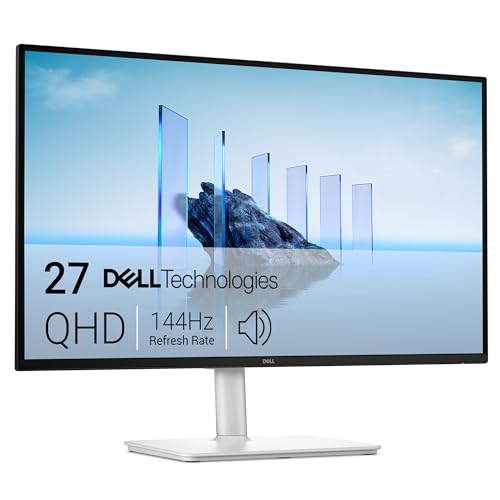
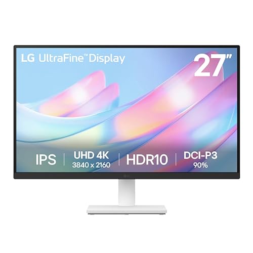
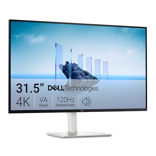
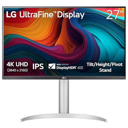
Who Should Buy Which Computer Monitors?
For Students and Everyday Readers
Course readings, lecture slides, mail, and web articles fill most of your screen time, and the sessions are usually an hour or two at a stretch. A 24 inch screen at 1080p gives you about 92 pixels per inch, which keeps ordinary text clean at a normal desk distance without any fiddling. Spend on a stand that tilts and a matte screen finish before you spend on size. If your reading is mostly articles and mail in a browser, our guide to the best monitors for reading covers simpler screens built for that lighter load.
For Writers, Editors, and Office Workers
Your day is one long document after another, often with a source file open beside the draft. A 27 inch screen at 1440p fits two readable pages side by side, and about 109 pixels per inch keeps small footnotes and tracked changes crisp. Text scaling in your system settings lets you enlarge the interface without giving up that sharpness. Prioritize a height adjustable stand and a flicker free backlight mode, since you sit in front of this screen the longest.
For Researchers and Proofreaders
You read scanned pages, archived PDFs, and dense reference tables where faint characters and uneven scans punish a weak screen. A larger panel with a matte finish helps, because old documents often mix faded print with bright white page backgrounds. Portrait rotation earns its keep here: a vertical screen shows a full page at once, so you scroll less and lose your place less often. Whatever you choose, plan your day around short breaks, because hours of close reading tire eyes on any screen.
Key Features to Compare
Five factors decide how a monitor treats long text. Start with pixel density, then check the screen finish, the stand, and the panel, and only then look at the speed figures that matter far more to players than to readers. Our guide to the best monitors for reading text gathers a shorter shortlist, and the sections below explain how to judge each entry yourself.
Pixel Density and Text Sharpness
Text sharpness is read by pixel density, stated plainly: a 24 inch screen at 1080p lands at about 92 pixels per inch, a 27 inch screen at 1440p reaches about 109, and a 24 inch screen at 1440p reaches about 122. More pixels inside each letter means smoother edges, so your eyes stop working to decode fuzzy characters. Bigger is not automatically better, because spreading 1080p across 32 inches drops density and softens text. For a wider comparison across screen types, see our guide to the best monitors for text.
Matte Finish and Room Light
A matte finish governs glare in a lit room, and most reading happens in lit rooms. Glossy screens mirror windows and ceiling lamps, so your eyes fight a reflection layered over every paragraph. Matte coatings scatter that light and keep the page steady, at the cost of a slightly softer look on photos.
Room light is part of eye comfort too: keep the room lit near the brightness of the screen rather than reading in the dark. No finish can treat eye strain by itself, but removing glare removes one steady source of squinting.
Stand, Mounting, and Ergonomics
The stand decides where the text sits in front of your eyes. Look for height adjustment that puts the top line of text a little below eye level, tilt for your chair height, and a stable base that does not wobble when the desk moves. A VESA mount pattern, most often 100 by 100 mm, lets you add an arm later and free up desk space. Swivel helps when you share a page with someone beside you, and pivot into portrait suits long document readers.
Panel Technology
Panel type shapes contrast and viewing angle. IPS panels hold color and brightness steady when you lean or shift, so text at the screen edges stays as dark as text in the center.
VA panels give deeper blacks, which can make black letters stand out on white pages, though fast scrolling may smear slightly. OLED panels are still rare at desk sizes and carry a burn in risk with static documents left open all day. Readers who care how a screen looks on the desk can also browse the best looking computer monitors for slimmer designs.
Refresh Rate and Response Time
These are gaming figures first and reading figures a distant second. A standard 60 Hz refresh rate redraws the page often enough for steady text, and a higher rate only smooths the motion of scrolling through long files. Response time, measured in milliseconds, describes how fast pixels change during fast action, which reading never demands.
If you also play, that is a separate purchase question, covered by our guide to the best computer monitors for gaming. For a reading desk, put this money toward density and a stand instead.
Common Mistakes to Avoid When Buying Computer Monitors
- Buying the biggest screen at the lowest resolution, which stretches the same pixels wider and makes text softer, not larger and clearer.
- Choosing a glossy screen for a bright room, then fighting window reflections layered over every page you read.
- Skipping a height adjustable stand and stacking the monitor on books, which locks your neck at one fixed angle all day.
- Paying for gaming speed figures you will never feel while reading, while the pixel density that shapes every letter stays low.
- Running a high resolution screen at tiny default scaling and leaning in close for hours instead of enlarging the text.
Tips to Get the Most From Your Computer Monitor
Turn off the vivid picture mode, which oversaturates color and hardens text edges, and pick a neutral or reading mode if your screen offers one. Set system text scaling so body text measures roughly what it would on paper, and raise screen brightness only to match the room, not to outshine it.
Build look away breaks into the reading day: every so often, rest your eyes on something far across the room before returning to the page. Breaks and balanced room light do more for tired eyes than any single feature, because no monitor treats eye strain. Clean the panel with a dry microfiber cloth only, since household sprays can cloud the matte coating.
Frequently Asked Questions
What features matter most in a monitor for reading text?
Pixel density, matte finish, and stand height matter most, in that order. One factor buyers rarely hear about is viewing distance: sit roughly an arm length from the screen, about 20 to 28 inches, and text at a given density looks sharper than it does when you lean in close. If letters still look rough at that distance, the fix is more density or larger scaling, not a brighter screen.
Is a 4K monitor worth it for reading text?
At 27 inches or larger, yes, if your computer can drive it and your budget covers a good stand as well. Text edges get visibly smoother than at 1440p. The catch is scaling: a 4K screen needs your system to enlarge text, and older software sometimes renders menus at fixed tiny sizes. At 24 inches, 1440p delivers most of the reading benefit for less money, so 4K earns its price mainly on bigger desks.
What monitor size suits a small desk for reading?
A 24 inch screen suits most small desks, since it leaves room for a notebook and a lamp beside it. Desk depth matters as much as width: a shallow desk puts any screen closer to your eyes, which argues for higher density rather than a larger panel. A VESA arm that clamps to the desk edge can reclaim several inches of depth and surface. Measure the footprint, not just the diagonal, before ordering.
How long does a computer monitor for reading text usually last?
Most desk monitors last about five to eight years of daily use before the backlight dims enough to notice. Reading is gentle work for a panel, since brightness stays moderate and the image changes slowly. A longer warranty term is a useful signal of build quality when two screens otherwise tie. When text starts to look washed out even at full brightness, the backlight is aging and replacement planning beats squinting through another year.
Does refresh rate matter for reading if I never play games?
Only a little, and only while you scroll. A higher refresh rate makes a long PDF glide instead of judder, which some heavy readers enjoy, but the moment you stop scrolling the page looks identical. Spend first on pixel density, a matte finish, and a height adjustable stand. If money remains after those three, a modest step to 75 Hz or 100 Hz is a pleasant extra rather than a reading upgrade.
IPS vs OLED: which panel is better for reading text?
IPS is the safer choice for a reading desk. Documents sit static on screen for hours, and static images are exactly what wears an OLED panel unevenly over time. IPS also costs far less at desk sizes, which frees budget for density and a stand. OLED wins on contrast for video and dark room viewing, so it suits a mixed entertainment screen better than a monitor bought mainly for pages of text.
The Bottom Line
Match the monitor to your reading routine first. Students do well with a 24 inch matte screen, heavy readers gain from 1440p density at 27 inches, and anyone at a desk all day should insist on a height adjustable stand. The best computer monitors for reading text share one trait: they make letters easy to forget about. Compare your shortlist against the product table above, and let pixel density break any tie.